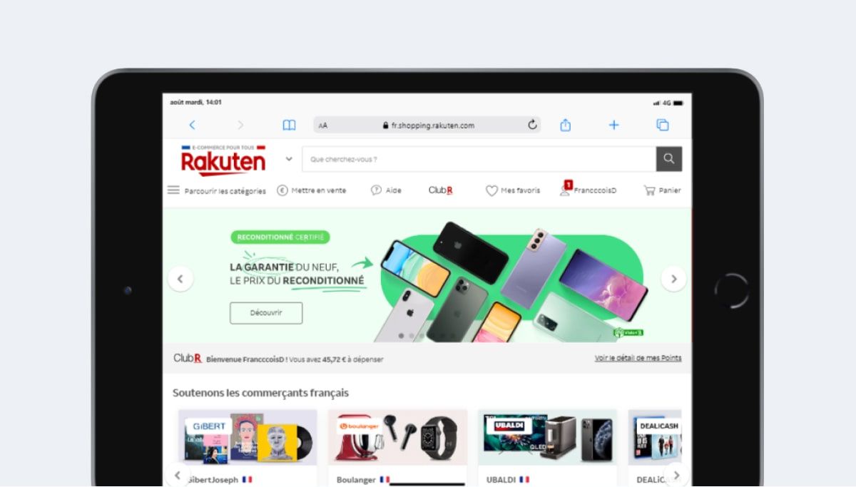
Viewport resolution (CSS rules)
It is the resolution that interests designers and developers the most because it determines the breakpoints and the definition of media queries. In general we only talk about this resolution.
For the Apple iPad Mini (6th Gen) (2021) it is :
- 768 pixels width
- 1024 pixels height ⚠️ the height is indicative because the Safari browser, Chrome, etc. reduce the visible area
ℹ️ Some analytics tools only display the manufacturer resolution (below) and not the one presented above, so be careful when interpreting the results.
Available in the simulator
Test your site now on this device Apple iPad Mini (6th Gen) (2021) using the browser extension.
It's free and can be activated in 2 clicks.
Pixel density
On the Apple iPad Mini (6th Gen) (2021) it is 2
If you want to target devices with at least this pixel density in CSS, you can use this media query.
                            @media only screen and (-webkit-min-device-pixel-ratio: 2) {

                                /* CSS */

                            }
Also in javascript, it is possible to retrieve the value of the pixel density.
                            window.devicePixelRatio

                            // Which will return the figure 2
Manufacturer resolution Apple iPad Mini (6th Gen) (2021)
Given the pixel density this gives:
- 1536 pixels width
- 2048 pixels height
Free HQ mockup PNG format
