New
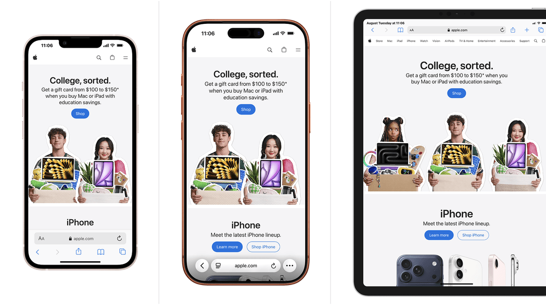
Multi-device comparison
Display multiple devices side by side and test them simultaneously. Single navigation, all breakpoints checked at once.
- Multiple devices in the same tab
- Shared navigation between devices
- Capture the whole in one image
Mobile simulator extension for Chrome, Firefox and Edge
Switch any page to mobile view, check your responsive web design on 81 devices, and prepare your client demos in one click. Without leaving your browser.


1,500,000+ installations · 4.9/5 on the Chrome Web Store
Free installation in seconds · computer only
One click to switch to mobile view, one click to return to desktop. The rest behaves like on a real phone: touch gestures, zoom, landscape mode, PWA.
New
Display multiple devices side by side and test them simultaneously. Single navigation, all breakpoints checked at once.
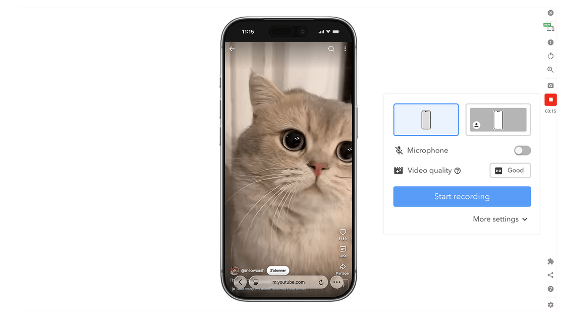
WEBM, GIF, or MP4 for your demos and tutorials, recorded directly from the simulator, with or without a camera.
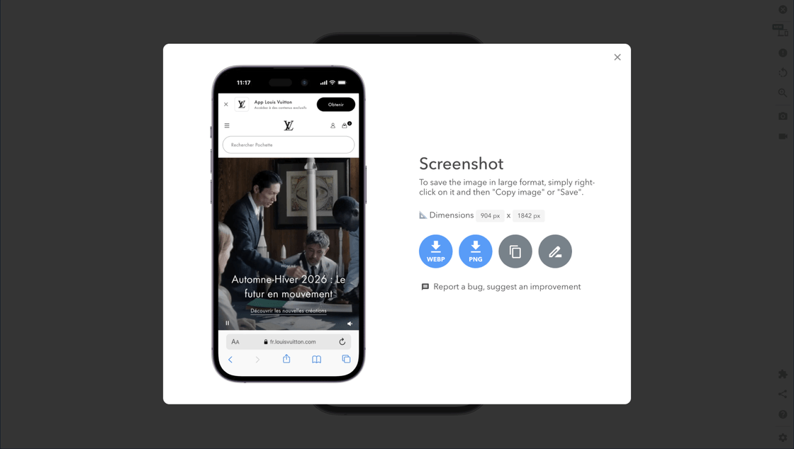
High-definition screenshots with a transparent background, ready for a presentation, mockup, or client email.
Finger gestures are natively simulated: inertia, bounce, zoom. Navigation behaves like on a mobile.
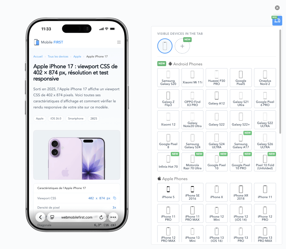
Create and save your own devices with the exact screen resolution and viewport of your target.
Each model applies its real CSS resolution, pixel ratio, and User-Agent: media queries and breakpoints trigger like on the device.
Works on any URL, including a local server, and with React, Vue, Angular, WordPress, or a static site.
PWA mode, full screen, native keyboard, instant landscape toggle, dark theme for visual comfort.
78 device mockups with transparent background, downloadable for free for your deliverables. View mockups
66 smartphones · 5 tablets · 9 desktop screens · 1 smartwatch
Old and new models, updated with each release. Each device includes its exact CSS viewport, pixel density, and User-Agent. Includes smartwatches, kiosks, and desktop screens.
Front-end development
Switch from 320 px to 1280 px in one click during integration, with the touch gestures and zoom of a real mobile.
Agencies & freelancers
Show the site in a realistic device, then export the video or cropped capture for the report.
Project managers & QA
Compare multiple models side by side, document anomalies with captures, and save hours of testing.
DevTools resize a window. Mobile FIRST replicates a device, and everything that comes with it.
| Feature |  | DevTools responsive mode |
|---|---|---|
| Preconfigured devices | 81, updated with each release | Short list |
| Realistic device display | Yes (browser & mockup) | No |
| Multiple simultaneous devices | Yes, side by side | No |
| Realistic touch gestures and zoom | Native simulation | Partial |
| WEBM, GIF, MP4 video capture | In one click | No |
| Captures with transparent mockup | Cropped PNG | Raw capture |
| Ready to show to a client | Yes | Debug tool |
Our rating on the Chrome Web Store speaks for itself.
The best responsive testing extension on the market!
Super intuitive, lightweight, and packed with features. The touch scrolling is incredibly realistic, and having over 70 ready-to-use devices is fantastic. If you're a front-end developer or UI/UX designer, it's an essential tool. 5 stars all the way!
The cut-out captures go directly into client reports or my PowerPoints. It replaces hours of manual editing 😊. Very satisfied!
It's a really underrated extension. It does the job and even a bit more. I would even like to try the Pro version to enjoy their cool features, but the free version is already great.
It's not just for web developers: I would say it would be useful for anyone who owns a site and wants to know at any time what it looks like on different devices.
Three steps, about thirty seconds, no account to create.
A mobile simulator, also called a mobile viewer or a mobile view extension, replicates the display conditions of a phone or tablet in your computer browser: CSS viewport, pixel density, User-Agent, and orientation. This is what lets you see any website in mobile view exactly as a user would, without having to pull out a phone for every change.
Mobile FIRST covers 81 preconfigured models: iPhone simulator, Android emulator, iPad simulator, Samsung Galaxy tablets, and laptop screens. Each device applies its real resolution, so your media queries and breakpoints trigger exactly as on the hardware. Portrait/landscape toggle, zoom, and touch scrolling are simulated to mimic native behavior.
The extension applies to the open tab, regardless of the URL: production site, preproduction environment, or local server during development. It works with React, Vue, Angular, WordPress, and static sites, without configuration. Designed for front-end developers, designers, and QA teams, it is used to validate responsive web design and prepare client demos.
No. Mobile FIRST is very accurate for daily development, but a final test on a real device is still necessary for complete validation.
Chrome, Firefox, Edge, Opera, Brave and any Chromium-based browser. Installation takes seconds and requires no account.
81 preconfigured devices: 66 phones, 5 tablets, and 10 desktop screens and smartwatches. You can also create your own devices with the resolution and viewport of your choice.
Yes, in one click, in WEBM, GIF, and MP4 formats. PNG screenshots are exported with a transparent background.
Yes. The extension applies to the current tab, regardless of the URL: production, preproduction, or a local server during development.
DevTools resize a window for technical inspection. Mobile FIRST replicates the device: realistic frame, touch gestures, zoom, multiple models side by side, export capture and video.
Yes, the list is regularly updated as manufacturers release new screens.
Without buying a single phone, without creating an account.
Free · 4.9/5 on 5,100 reviews
1,500,000+ users


